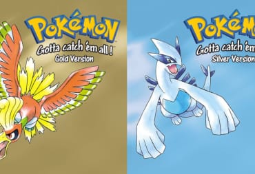
I said in the last article that the Pokemon designs of Gen 2 are among the most solid of the entire series. A large number of the 100 plus added pocket monsters were eye-catching, and when first released in color on the Game Boy Color in 2000, stood out as strong additions to the roster. Unfortunately, Gen 2 is also responsible for some pretty terrible designs as well, and while the number is fewer than the other games in the series, the ones at the top of the bad pile stick out like sore thumbs when compared to the rest of the Pokedex.
This article is one in a series we’re calling the Year of Pokemon, which celebrates the beloved pocket monsters and their many games.
What fuels the bad design this time? A lot of factors of course will play into it but one unifying theme that hits a lot of the Pokemon of this generation stems from their forgotten status. Half of the list are a single-stage Pokémon that never really made great impressions when first released, while the other half have evolved, or are evolved forms that simply lack a good visual treatment that makes them fully stand out. All but one are also poor battlers, which contributes to this stigma of being forgotten.
So which Pokémon are on this list? As with the previous lists, some ground rules before we begin. First, no legendary Pokémon will be featured here. Second, only one Pokémon per evolutionary line will be mentioned. Finally, the list will combine design aesthetics, competitive viability, and overall impact as part of the criteria of their design.
With this all out of the way, here are six of the worst designed Pokémon of Generation 2, in alphabetical order.
Delibird
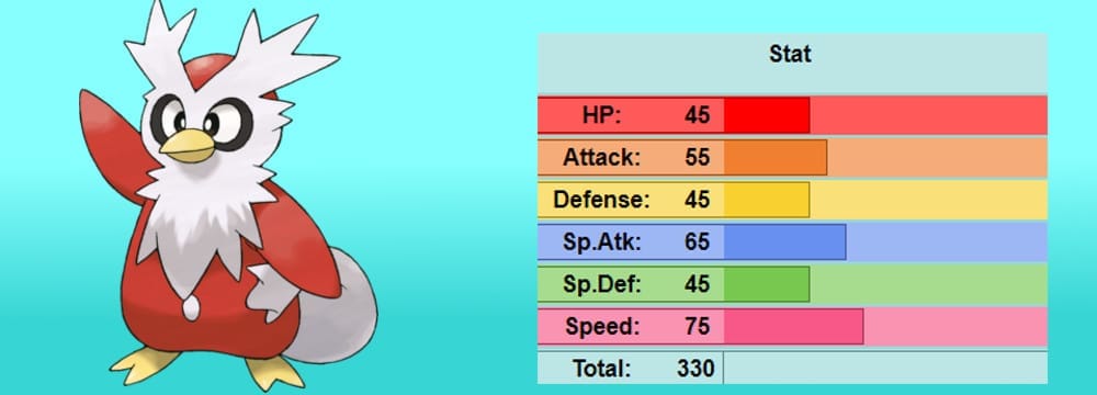
It’s hard to find a starting point as to why Delibird simply fails as a design. The concept behind it, being a penguin mixed with Santa Claus, is a bit off-putting even by Pokémon standards. The ability to distribute presents from its tail, which it holds like a giant sack … is a just simply bizarre from a design standpoint. Its stats are poor across the board, its typing is incredibly weak, and it really has no redeeming values when it comes to competitive use.
So why does it exist? The reason is simple, the move Present.
Delibird is one of many Pokémon where their entire design and moveset is wholly behind a singular gimmick. Like Mr. Mime in the last list, Delibird’s claim to fame is the only Pokémon that can learn the move Present naturally. The move is a Normal-type move that deals random damage—between 40-120 base power when calculating the damage—or has a chance to heal the opponent's Pokémon by ¼ of its health.
So what you have in Delibird is a move that has random powers and effects, with 90% accuracy, and is the only move in the original Pokémon Gold and Silver games that he can learn naturally, without breeding or TMs. Present has no real value as a move, other than the surprise factor it can employ against opponents, but suffice to say, its unreliability makes it a terrible gimmick to even use in casual formats.
Combine this with a really small movepool (the only noteworthy moves Delibird has are Freeze Dry, Spikes, and Destiny Bond) and a design that pretty much is a visual joke for the gimmick it employs, makes it a poor Pokémon on all fronts. Delibird simply lacks the stats and movesets to be competitive, and visually it is just a one-note joke that is hard to take seriously when compared to the rest of Generation 2.
Girafarig
Girafarig is a story of what could have been. Design-wise it is based on a pun, originally supposed to be a palindrome, which is a word, phrase, or number sequence that reads the same backwards and forwards. It’s entire body is supposed to reflect that pun, from its two-headed body to both its English and Japanese name.
The problem, however, is that the beta design of Girafarig is a better representation of that pun. Beta designs of Pokémon are rare to come across, and only the first three Generations have a fair number of these beta designs either leaked or captured for the public. Generation 2 in particular had numerous Pokémon that the Internet will never forget, mostly stemming from the infamous Pokémon Gold and Silver demo that was originally released in Japan Spaceworld in 1997. It should be noted that Pokémon Gold and Silver only had a three year development cycle from 1996, and well before the Pokémon craze reached the West in 1998, there were hints of the new Pokémon already being revealed in 1997.
Very little footage or screenshots of the demo exists today, and from it, a number of Pokémon and designs were lost, including the fabled original two starters known as Kurusu and Honoguma. What footage and images we do have, however, showcase minor screenshots of several early Pokémon designs, including Slowking, Donphan, Marill, and Girafarig. Many of these Pokémon were relatively unchanged, but Girafarig had a fully palindromic design—a fully grown head on its behind in all black, with yellow spots along the neck.
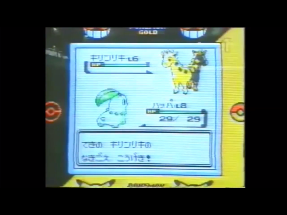
For my money, the prototype design is better. The re-design with the smaller head on its tail simply lacks the impact of a double-headed creature. It also is a design choice that was used several times in both Generation 2 and Generation 3 with the likes of Mawile, Wobbuffet, and Wynaut to varying degrees of using “lures” or having two heads.
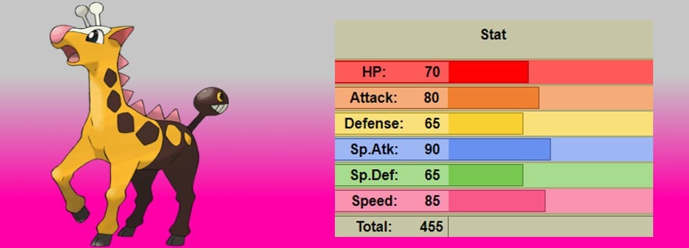
Girafarig also doesn’t have much going for it competitively. It does have a diverse movepool, and its fairly evenly-distributed offensive stats of 80 Attack and 90 Special Attack give it just enough power to pick off weaker opponents. The problem is its stats have been the same for nearly 20 years, with no stat going beyond 90. Other single-stage Pokemon have been given evolutions, small stat boosts, or even a mega-evolution over time. Girafarig has been left in the dust instead, another forgotten Pokémon with a fairly weak design.
Porygon2
I must confess, but I never liked the Porygon line. The concept is pretty cool, being a virtual Pokémon fully created by man. The original Porygon did have a standout design; this sort of blocky, late 90’s 3D look is charming in its own way because of the emulation of technology at the time. When Porygon2 was revealed, though, it jumped the shark for me.
It makes sense thematically; as technology improves 3D artists are able to smooth out the edges of their original, sort of polygonal work. Thematically how Porygon2 evolves is also pretty clever to this; it can only evolve if you trade it with the upgrade item, highlighting how the upgrade of technology leads to “sharper” images. Still, something is simply off for me when it comes to Porygon2.
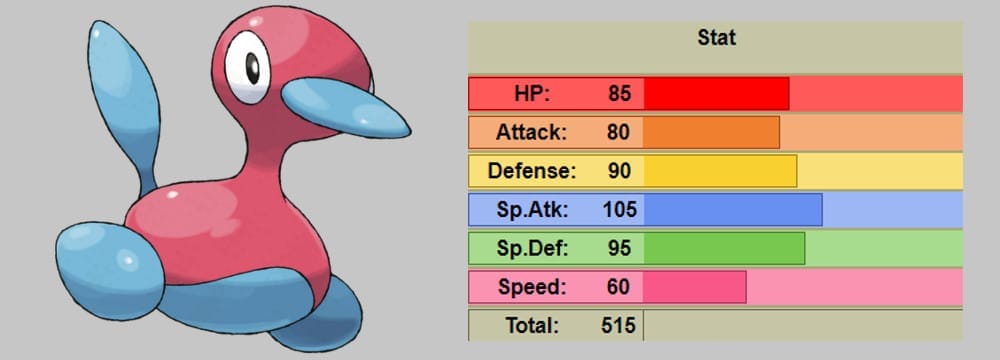
Perhaps it’s due to its in-game movements being akin to a drinking bird, or it’s sort of duck-like appearance in general. I never saw the original Porygon as a bird; it was instead a mess of polygons forming a monster-like form that allowed it to stand out. It certainly isn’t due its potential in battle; powerful stats and access to the ability Download and the item Eviolite make it a massive threat as a Pokémon, capable of defensive pivoting in single battles and a potent offensive threat in doubles.
Porygon2 just seems bland in comparison to its whole evolutionary line. The limitless technology we have creating something artificial, and what we get is something fairly plain-looking that, if fully in 3D, would be sleek and streamlined for all of us. Even Porygon-Z, the virus-ridden evolution of Porygon2, has cleverness to its design with its broken-looking frame and glitching, twitching eyes. Porygon2 just falls into the bland category in the end; it pales in comparison to its whole evolution, and in the case of creatures featured in Generation 2, it is probably the most generic of the slew of Normal-types released in the game.
Snubbull
I remember the first time seeing Snubbull during the short Pikachu’s Vacation before the first Pokémon movie. It was one of the few Gen 2 Pokémon officially revealed at the time in the West, along with Marill and Donphan, but of the three it was the most awkward-looking of the bunch. Was it wearing a pink, polka-dotted dress? Was it part of its body? Why is it called the “fairy Pokémon?”
I guess there is a visual joke here that its pink, dress-like body contrasts with its scowling, bulldog head. Snubbull is an example of a design that is too “busy” for my tastes. There are a few designs that hit this negative button—and later generations it becomes more of a problem for sure—but for now Snubbull is among the first designs to just hit all the wrong notes in terms of aesthetics.
Many fans speculate the fairy Pokémon is based on the Cù-Sith, a Scottish mythological creature that was shaped as a dog (literally translated to “dog fairy” in English). The problem is none of its features really resemble a description of Cù-Sith. While Game Freak takes a ton of liberties when designing Pokémon, usually there is a kernel of the design's origins left in as reference. If Cù-Sith was the influence behind Snubbull, it’s a visual reference over a specific one, which is inherently a bit lazy when compared to the origins and visual treatments of other Pokémon in the games, such as Houndour.
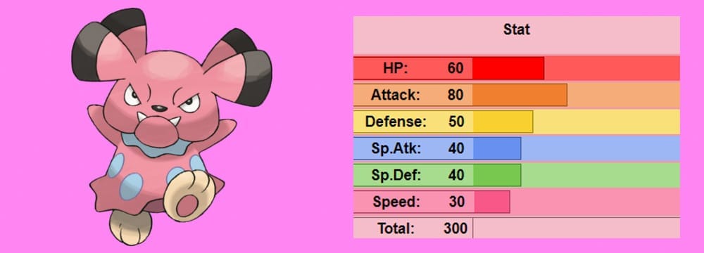
Snubbull is one of the few Pokémon to gain relevance as a Fairy-type after Generation 6 at least. While not the most powerful battler, its 80-attack and access to the only physical Fairy-type move in Play Rough give it a strong presence in Little Cup formats. Snubbull doesn’t have much else save for its Intimidate ability, which lowers the opponent's attack, and a few oddball moves like Fire and Thunder Punch and Superpower. The Problem is, Snubbull is a predictable Pokémon in Little Cup, and combined with its slow Speed stat it requires some setup to use properly.
Sunflora
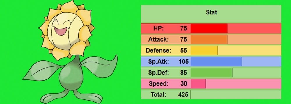
We go from a head-scratching design to a lazy one with Sunflora. The sunflower Pokémon that is … a sunflower.
That’s it.
There is little else to say really. It’s just a sunflower with a face and moving leaf hands and feet.
Ok, ok, the reason for the design being lazy is that it goes too simple in terms of its look. Simplistic designs can work in Pokémon. I did praise the simplicity of the likes of Gengar for example. What makes a good, simple design though is how it works on all cylinders to complement the concept of its design. For Gengar, it was the concept of a shadow or doppleganger, so the simple shape and color scheme worked well to represent that.
Sunflora is what happens when you get a simple design that has no real substance to it. It simply has no concept, other than being a sunflower, to back up its visual look. Sunflora is just incredibly bland to be memorable in this case, a design that “feels” lazy and inept when compared to other Pokémon in the Gen 2 Pokedex.
It also doesn’t really have much power to help it out either. Its Special Attack is good at a base 105, but its low base-stat total of 425, as a fully evolved Pokémon, really lets it down. Being a pure Grass-type also limits its potential, and its slow Speed combined with five major type weaknesses means Sunflora has little defenses against most of the Pokémon in the game. The silver lining is using it as a Chlorophyll or Solar Power sweeper, or utility in double battles, but Sunflora is simply outclassed in most of these roles, becoming a poor man’s Florges, Cherrim, and Comfey at this point.
Unown
Yeah … this is shooting fish in a barrel maybe, but I can’t think of any Pokémon who more deserves to be on a worst design list.
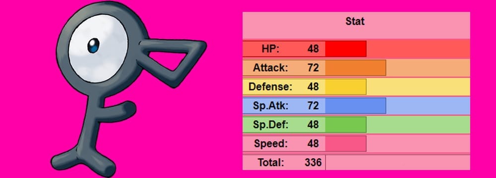
Unown is, like Delibird and a few other Pokémon introduced in Generation 2, a gimmick first. The gimmick here is the fact that there are 28 different forms of Unown—26 letters and two punctuation-types—that can be caught or transferred through the games they feature. Floating letters … with a giant eyeball to denote what they are looking at.
Stat-wise there is nothing to really talk about; they have terrible stats and learn only one move, Hidden Power. Unown are also one of the few Pokemon in the game incapable of learning any other moves. So what is Unown’s hook in the end?
There is one redeeming factor to Unown; its place in Pokémon lore. In-game, the Unown are only found in ruins, used as communication tools that reveal secrets and hidden messages. It is speculated in-game that Unown are ancient Pokemon of considerable power, hence their Psychic typing and use of the move Hidden Power. Officially, Unown come from their own dimension, which was first revealed back in the Pokémon anime and Pokémon 3: The Movie. Considering the state of Pokemon today—with the introduction of alternate universes, Ultra Beasts, and other dimensions in Pokémon Sun and Moon—perhaps Game Freak had plans to introduce these increasingly sci-fi elements to the franchise.
If Game Freak had plans to bring in extra-dimensional beings way back in the late 1990s, then Unown was the dry run to see how that would work. Still, the mystery of Unown is more engaging than the overall design and usefulness of Unown as a Pokémon. Unown is a talking point; a Pokémon used to speculate on the franchise and its hidden history for a YouTube audience over something that is visually striking and competitively viable.
Well, there you go, another set of bad designs is done. Gen 2 didn’t have too many, but the ones it did have hit hard. Still, Generation 2 is, by many Pokémon fans, the benchmark of excellence for the entire series. While it is not quite my favorite Generation after twenty years, it still is one of the most memorable, thanks in part to the solid, and even terrible, designs the game has.
Next time though, we get tropical with Hoenn and explore what Generation 3 has to offer. Until then, have fun Pokémon fans.
What do you think of this list? Leave your comments below.
All stat blocks courtesy of Bulbapedia.
Have a tip, or want to point out something we missed? Leave a Comment or e-mail us at tips@techraptor.net
