
From one year to the next the art of video games seems to take it up a notch across the board. There are so many memorable looking games, be it for their crazy realism or their perfected style. There was quite an array on display for 2017, which you can see in our nominees.
Here's the list of nominees (and here's the list of nominees for all categories):
- Cuphead (Our Review)
- Horizon Zero Dawn (Our Review)
- Persona 5 (Our Review)
- Star Wars Battlefront II
- The Legend of Zelda: Breath of the Wild (Our Review)
Readers' Choice - Cuphead
This was probably the easiest award to give out this year, and it's no surprise that you all went with Cuphead. Cuphead captured the aesthetic it was going for so perfectly that had it existed in the 30s, nobody would have noticed the difference. From the drawings themselves to the animations, Cuphead's visual presentation is as close to perfection as we're likely to get.Third Place - Horizon Zero Dawn
By Sam Guglielmo
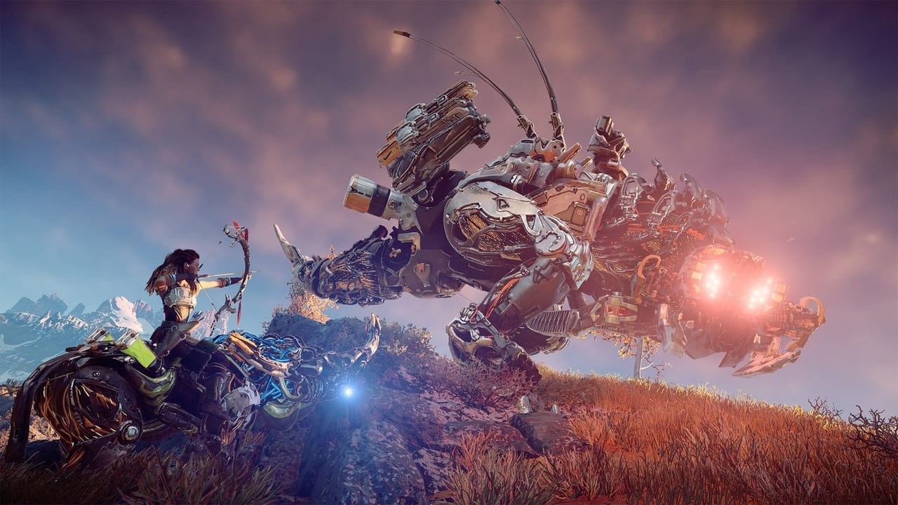
Look at these robotic dinosaur animals. Ain’t they a beaut? Both artistically and technically of course, and that’s really why Horizon: Zero Dawn is a wonder to behold.The game takes place in a post-post-apocalyptic setting. We’re done with the dusty wastelands and ruined buildings, and nature has begun to take over again. Every environment in the game is just covered with lush and beautiful greenery, making the game truly feel like it's a world reclaimed by nature. Skyscrapers jut out of the ground with vines running up their sides and tangling in and out of broken windows. Despite this, humans live in dilapidated homes and cities created of whatever could be scavenged.
It’s not a video game without dangers, and Horizon provides its robotic animals for that. While “robotic dinosaurs” is the most commonly used description, the truth is that there’s plenty of different robotic animals. Deer, crocodiles, bulls, hawks, even crabs all have weird giant robot counterparts. Most importantly, all of them are lovely. There was some real effort put into the artistic design behind these "animals" and it makes them blend into the world and feel completely like they should be at home there.
Then you piss one off and it tramples trees and destroys wilderness to come after you, leading to a completely different sort of artistic direction. These monsters in motion are equally terrifying, with guns popping out of their body, tails suddenly being equipped with lasers, and more strange weaponry. This sudden shift from peaceful to violence is equally amazingly done, another massive win for the Guerilla art team.
Every part of Horizon: Zero Dawn is beautiful, and it makes sense why it would be turning heads and winning awards for its beauty. I hope all of Guerilla’s follow ups show the same sense of wonder shown here.
Second Place - Persona 5
By Kyle Johnson
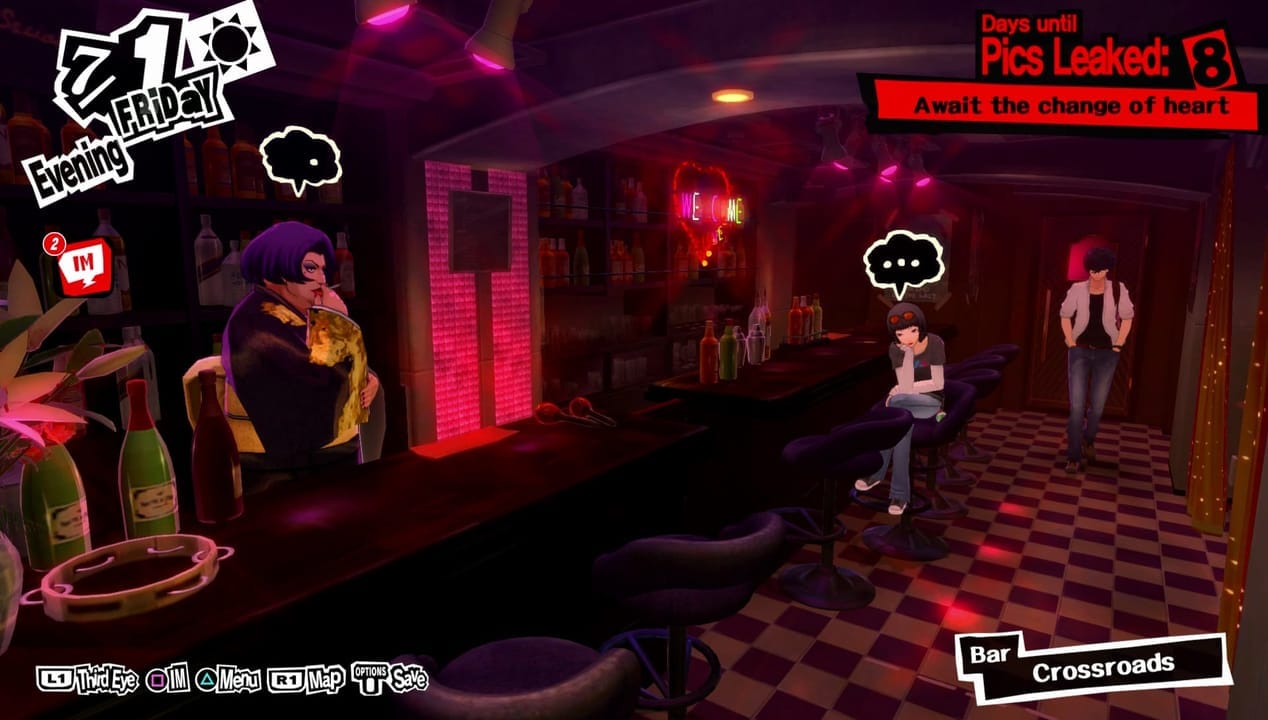
It's impossible to speak fondly of Persona 5 without mentioning its visual style. Combining the highly angular nature of graffiti with '80s punk aesthetics, Persona 5 bleeds style. Every element, from the battle effects and UI to shopkeepers and dialogue has been carefully crafted to highlight the use of the aggressive red and black colors. The use of color and UI blends excellently with the rebellious nature of its characters and story.This is without mentioning its representation of Tokyo. While Shibuya and other main thoroughfares buzz with activity, the side streets are more homely and reserved. Idle chatter may not be important to your personal story, but it makes Tokyo feel alive. Persona 5 may not be open-world, but the vast cross-section of Tokyo that it presents is important for the rest of the visual cohesion.
Of course, this is not the first Persona game to use its visual style to communicate themes. Persona 3 used blue hues to convey loss and isolation, and Persona 4 used yellows to accent the energy and upbeat nature of its main cast. Persona 5, however, goes above and beyond in presentation and cohesion. Were it not for its atmosphere, Persona 5 might not have been as successful as it is. Inarguably Atlus's best looking Persona game to date, Persona 5 will be talked about for years to come.
Winner - Cuphead
By Robert Grosso
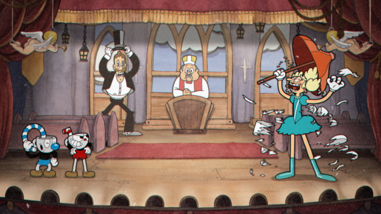
While Legend of Zelda dazzled with its soft artist brushstrokes and Persona 5 amazed us with a dark yet contrasting comic-book style, it was independent studio StudioMDHR’s Cuphead that stole the show when it comes to graphical fidelity, and did so in the most painstaking way possible.Invoking the jerky, squashy animation of the 1930’s era of cartoons, Cuphead has a lot going for it when it comes to visuals and presentation. The style is wholly reminiscent of a day long gone, a type of animation style that’s heyday is now from a bygone era. Yet this old school style makes for a new fresh coat of paint for one of the most impressive run and guns in a long while, and it is all thanks to the visual fidelity that Cuphead presents to the player.
It is a living cartoon, a Fleishcer-styled fever dream of wickedly grinning monstrosities hoping to wallop Cuphead and Mugman into submission. What makes it work is how painstakingly detailed StudioMDHR went to create the effect, spending years working on the visual graphics alone, hiring actual cartoonists such as Willard Bowsky and Ub Iwerks to bring the vision alive. That detail included hand-drawn animations, watercolor backgrounds, and film-standard animation at 24 frames per second, intermingling with the smoothness of 60 FPS of a video game.
If the game had been any other way, perhaps the striking visuals would see Cuphead lost in a sea of run and guns and indie arcade shooters. Shoot 'em ups with smooth controls are often a dime a dozen, especially when it comes to the oversaturated indie market. It would have been easy to create a solid game that apes 8-bit visuals as the primary gimmick, but greatness is rarely achieved by going down the familiar path. StudioMDHR took a massive risk with Cuphead, and its very nature by daring to be different only spotlights the labor of love even more. What began as a passion project by two enthusiastic brothers over anachronistic cartoons has morphed into one of the most visually refreshing indie titles in years.
It took nearly a decade for Cuphead to see fruition, but the labor of love translated so well that the game's visual presence cannot be understated. True, the gameplay is top notch on all levels, from the right degree of challenge to the balanced two-player action, but many good games fail unless they attract players to their title. The cartoon-look is what makes Cuphead; it is a visual style so distinct it was perhaps the leading factor that helped it surpass over a million copies within two weeks of its release, and one of the best games to be released this year.
What did we miss? What did we get wrong? What game would have won the award for you?
Have a tip, or want to point out something we missed? Leave a Comment or e-mail us at tips@techraptor.net

Andrew is the Editor in Chief at TechRaptor. Conned into a love of gaming by Nintendo at a young age, Andrew has been chasing the dragon spawned by Super… More about Andrew