Hey, it’s been a while.
A few years back, during our first Year of Pokemon, I started working on a fun little series judging the best and worst Pokemon designs from each generation, up to that point.
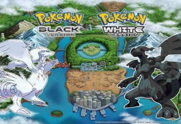
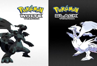
Well, to make a long story short, I am going to try and finish that series now, right where I left off with the worst of Generation 5.
Gen 5 is arguably the most polarizing Gen of Pokemon, with a lot of die-hard fans (myself included) who believe it to be among the series best, and a lot of detractors arguing it’s among the worst. What I can say for sure, however, is the designs of Gen 5 are fairly criticized by many for being too ugly or analogous to previous generations.
While I don’t personally hold that opinion, it is true that Gen 5 has some pretty rough or poor designs. I already focused on the best designs of Gen 5, so let’s tackle the six worst designs right here.
As always, some rules before I continue. First, no legendary Pokemon will be featured on this list. Second, only one per evolutionary line will be showcased. Finally, the list will combine design aesthetics, competitive viability, and overall impact as part of the criteria of their design.
Garbodor

Yeah, I guess this one was almost a given.
A lot of people criticize Garbodor and it’s pre-evolution, Trubbish, for being terrible designs, and to an extent, people are right. Garbodor is a Pokemon whose idea behind it is actually pretty good: living trash that comes from the game based around New York City itself.
In a way, I can respect the dedication to the theme there. After all, New York City was notorious for having one of the largest landfills in North America up until the early 2000s. That said, my problem with Garbodor is the entire look of it is too clunky and over-designed. The gunky, overflowing trash with colored chunks wedged in between it is such a nasty aesthetic it is pretty repugnant to look at. I guess that is the point, but it doesn’t make it well made.
Battle-wise, Garbodor is the definition of mediocre. Stat-wise it is pretty even, with solid enough defensive scores of 80/82/82 in HP, Defense, and Special Defense. Its Attack is a decent 95 as well, but Garbodor is best used defensively as a utility Pokemon. Stockpile, Toxic Spikes, Recycle, Toxic, and Haze would be good choices, while Gunk Shot would be the primary STAB. Sadly, Garbodor lacks any versatility, so it is pretty much a one-trick pony.
Heatmor

Heatmor is a design by Ken Sugimori himself, and it is arguably one of his worst. Based on an anteater, Heatmor’s biggest problem is its mix of mechanical bits that are made to look too natural. The pipe-like designs across its back, bottom, and tail, coupled with heated coils across its claw-like arms look unnatural and garish. The colored body with the red and yellow stripes also just clashes with the tan pipes too much, and the overall shape of Heatmor is pretty chunky over elegant.
Heatmor’s design is just busy and over-thought, and this really hurts its overall appeal. Since it is a counterpart to the totally generic steel/bug design of Durant, I guess the idea was to add a sort of inorganic bit to its look, but it just doesn’t work. Heatmor comes across as a clumsy, hunched over monstrosity that is more prey than the predator it is supposed to be.
The reason it is prey is due to its stat spread. Heatmor has high Attack and Special Attack, capping at 97 and 105 respectively, but everything else is on the mediocre side, in particular its 66 Defenses and Speed. As a pure Fire type, it has little in the way of coverage as well; its physical movepool is more diverse but suffers a bit by having only a few viable moves, from its signature Fire Lash, Flare Blitz, Drain Punch, and Sucker Punch being the only standouts. Heatmor has nothing going for it, and is so forgettable it’s a wonder that anyone would remember its existence as the counterpart to Durant.
Simisear

One of the design choices for Pokemon Black and White was to introduce a gym where you would be at a type disadvantage at first between the Grass/Fire/Water gym in Striaton City. This is also almost immediately ruined by being granted one of three “elemental monkeys” to be a counter to your opponent's type. The monkeys are based on the three wise monkeys, as well as motifs involving cooking and their selected element. And all three of them are pretty generic.
The worst of the bunch, however, is poor old Simisear. This is one of those choices that is really more scientific than anything else, as Simisear is notorious for being considered one of the least popular Pokemon in the game. All of this stems from a poll conducted in Japan during Generation 7 where Simisear was ranked dead last in 720th place. Its goofy face doesn’t help it much in this department anyway, so it’s no surprise it got the dubious honor back then.
Battle-wise it’s not that special either. All three elemental monkeys have the same stat spread of 98/98/101 offensive stats, with mediocre bulk and defense. Simisear, being a pure Fire type, lacked a lot of the power and utility its monkey counterparts had, who also struggled to stand out over the years thanks to their rather tepid movepools. There really is little of note here for attack or defense outside of the old standbys of Flamethrower, Will O’ Wisp, Superpower, and Knock Off; the elemental monkeys are designed as second, basic starters, and Simisear is sadly the most basic of them all.
Stunfisk

Stunfisk is my personal choice for being the worst design out of Gen 5, and it is mostly because I think it just fails in what tries to deliver. The idea of a flat fish trapping and zapping people is cool in concept, but execution-wise the dopey look of its face and mouth, combined with the odd exclamation point across its flat body and weird yellow/tan contrasting colors, just ruins it for me.
Stunfisk is supposed to be based on flatfish like flounders but is not a Water type. That is due to type balancing; originally it was supposed to be Electric/Water, but was changed at the last minute to Electric/Ground. It was also on purpose to make it as flat as possible, at least according to Stunfisk’s designer, Mana Ibe. Well, job done there, at least, but when you're so flat that in the 3D games you can barely see any part of its aesthetics, I don’t know if the trade off was worth it.
Ground/Electric is actually a decent combination offensively, but Stunfisk has decent defensive bulk with minimal offensive power. It’s Special Attack is the highest attack stat at 81, and while it does have a diverse enough movepool with STAB Thunderbolt, Earth Power, Electric Terrain, Foul Play, and Scald at its disposal, it just doesn’t threaten much due to its lower power. Overall, Stunfisk is pretty bad visually, pretty bad competitively, and even with the improvement of an alternate form in Gen 8, pretty forgettable ultimately.
Vanilluxe

Vanilluxe is the poster boy for bad Pokemon design in Generation 5. Almost everyone makes fun of the Vanillite line, one of the first lines designed by James Turner, the eventual art director of Generation 8. Turner is one of the only western developers working in The Pokemon Company today, starting as a designer on the likes of Shadow Lugia for XD: Gale of Darkness. He designed some of the more unusual and imaginative creatures in the form of a few Ultra Beasts like Poipole, Nagadanal and Buzzswole, Golett and Golurk, Centiskorch, and more.
Turner is a pretty good designer… and if I were honest, I like the Vanillite line in general. I actually would argue it gets a bad rap for being poorly designed, but my one exception is Vanilluxe. My problem with it is the same problem I have with a lot of Pokemon with multiple faces: it just looks odd to me. I don’t mind the ice-cream motif on Vanillite or Vanillish, (since the ice cream is really just camouflage, the Pokemon itself is just pure ice covered in snow), but Vanilluxe is just over-designed purposefully to look more like food than anything else; the two scoops of snow, the two faces, the waffle-cone design, and the giant straw-like appendage on top just add too much to what is honestly something that should have stayed simple.
Vanilluxe is over-designed, and it’s a shame because as a battler, it’s not horrible. It has a tough hill to climb though; as a pure Ice type, one of the weakest defensively in the game, it doesn’t have the bulk or stats to really stand out. It makes up for it by being a solid user of the ability Snow Warning, which automatically starts a hailstorm when it is brought onto the field. It can also dish out some heavy damage with STAB Blizzards at 110 Special Attack. It’s pretty predictable, but solid enough.
Watchog

Generation 5’s rodent line is pretty subpar overall. Patrat is a big, bulging-eyed thing that’s a cross between a chipmunk and prairie dog. It’s serviceable but unremarkable, sporting the lowest stats in all of Pokemon Black and White. Watchog, however, takes this a step further by turning that rodent into a tall, nightmare-inducing creature with even bigger, wilder eyes.
That is sort of Watchog’s gimmick: It watches you. Like a voyeur. With its creepy, hypnotic eyes. There are a few bits I like about its design; its fur pattern is actually based off a safety vest you would see on road workers and crossing guards. But the eyes, along with the elongated body, just do nothing but make me want to look away at this rodent’s scary gaze.
Watchog is less intimidating when you look at its battle stats, which are pitifully low like most of the region rodents are. When your best stat is an 85 Attack, you know you have problems. Now it does get one cool ability with its hidden ability Analytic, which boosts the power of attacking moves when the Pokemon moves last in a turn. Sadly, Watchog might be a bit too fast at base 77 Speed to really make use of it, and frankly it doesn’t really have much in the way of attacking moves to be effective anyway. You are better off leaving Watchog in your box... staring at you each time you open it again.
And well, there you have it. It’s been a long time coming, but here are the six worst designs from Generation 5. Pokemon Black and White and its sequels are some of my favorite games in the series, but even games we love have good and bad bits to them. The question now is, do you agree with our choices here, or are there worse designs from Generation 5 that we may have missed?
Leave your comments below, and be on the lookout for next time, when I go over the best and worst designs of Generation 6.
Have a tip, or want to point out something we missed? Leave a Comment or e-mail us at tips@techraptor.net

A longtime player of games, creator of worlds, and teacher of minds. Robert has worked many positions over the years, from college professor to education… More about Robert