We've reached a point in gaming where pretty much every game that is released looks good. Whether or not it's a cohesive visual design is another thing. Reaching some sort of photorealism, which is still being strived for, isn't the end all be all as it seems to have been in the past either. Diving into interesting, sometimes really weird, worlds is something we all want to do from time to time, and here are the games for 2019 that let you do that the best.
Here's the list of nominees (and here's the list of nominees for all award categories):
- Control (Our Review)
- Death Stranding
- The Legend of Zelda: Link's Awakening (Our Review)
- Manifold Garden
- Sayonara Wild Hearts (Our Review)
Readers' Choice - The Legend of Zelda: Link's Awakening
Developer: Grezzo | Release Date: September 20th, 2019 |
The Legend of Zelda: Link's Awakening remake looks like a plastic world of toys come alive. The tilt-shift effect pulled this off amazingly well, making every frame look like some genuine miniature plastic models someone made to have their own Zelda world in real life. Combine that with one of the classic Zelda games and you've got a recipe for a pretty powerful nostalgia bomb.
Third Place - Death Stranding
Developer: Kojima Productions | Release Date: November 8th, 2019
By Andrew Otton
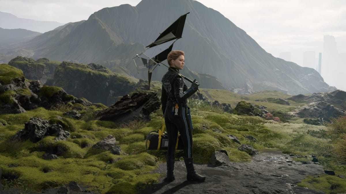
Death Stranding won't be winning any awards for creating an accurate visual representation of the United States. Even though the game has you trekking from the east coast to the west coast, what you see in-between isn't all that recognizable most of the time. However, what you do see is definitely a treat. From some of the best looking mountains and snow in a game, to the Iceland-esque rocky plains, Death Stranding always was stunning to take in.
The best part, though, is the weird sci-fi nonsense throughout the game. The first time you fail escaping a BT to be dragged under in their black goopiness will be a moment I always remember. The spontaneous sea of tar with buildings, cars, and other debris suddenly floating to the surface only to sink away as though nothing happened when all was said and done was always amazing to see.
From the odradek, to the packages, to the gear Sam wears, what you see directly impacts the way you play. Kojima's forever weirdness and unique vision was wonderfully on full display in Death Stranding.
Second Place - Sayonara Wild Hearts
Developer: Simogo | Release Date: September 19th, 2019
By Robert Scarpinito
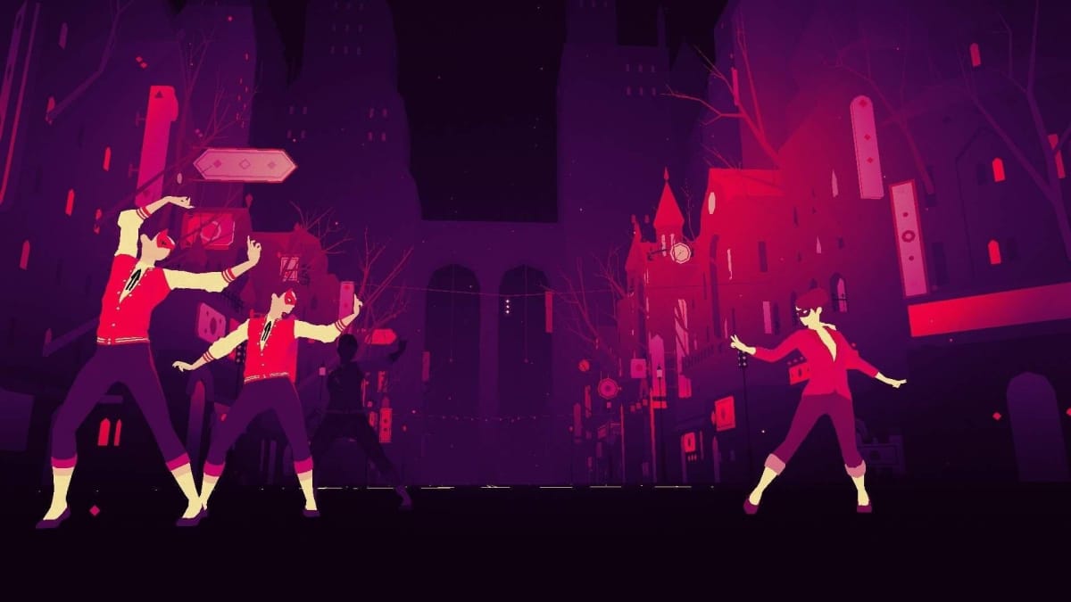
It only takes an hour or so to see everything Sayonara Wild Hearts has to offer, but that doesn't mean you should sleep on it. Simogo developed a visual tour de force to accompany its addictive, bumping beats. The bright, vibrant colors move to the music, overloading the eyes with a maelstrom of hues. The simple visual language conveys exactly what the player needs to see, no matter how fast the protagonist runs, flies, or drives. Amid the cool color palette, collectibles sparkle and obstacles stand out.
Aside from the easily navigable landscapes, the way the colors play with each other synergize perfectly with the soundtrack, accomplishing Sayonara Wild Hearts' mission as a pop album video game. The dreamy, melodic chorus of "Begin Again" feels at home among all the neon pinks and rich purples of the stage. Meanwhile, the dark blacks and deep blues of "Dead of Night" evoke images of being chased through a forest at dusk. With its memorable approach to artistic style, Simogo has married its soundtrack to its stellar visual design.
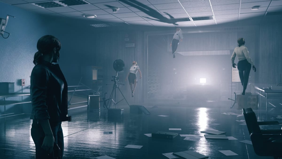
Winner - Control
Developer: Remedy Entertainment | Release Date: August 27th, 2019
By Sam Guglielmo
Everything in Control breaths. I remember this being the first detail of the game that I really noticed. The gun breaths, the wall breaths—everything is alive. Once I understood this simple fact, Control's art suddenly meant so much to me. I know it's based on Brutalism, but it's some twisted living Brutalism that absolutely destroys all perception I had of the architecture style. Watching levels literally shift and distort themselves to entirely new shapes is a real treat, and I came to love every bit of movement.
Yet it's not just the shifting levels that hit this high. I love the way the gun looks alive, also changing its form as needed. The boss designs are fantastic, and there's something terrifying about the monsters you find yourself up against. There's plenty of live-action content, filmed in a fantastic superimposed style that manages to catch the eye. One guy dances around in his underwear in an apartment, which is always fun.
What also really does it for me is the destructive environments. It seems like the art team just knew how to make a place we'd love to wreck. Sure an office may not seem super interesting at first, but watching bits of it get ripped out, thrown across the room, and exploded into splinters by bullets is always a real joy to behold. Simple things like this are why Control's art direction really excelled, and why it's winning our award for the best visual design.
What did we get right? Wrong? Miss anything? Let us know in the comments below!
Have a tip, or want to point out something we missed? Leave a Comment or e-mail us at tips@techraptor.net
