We're slowly trudging our way to the point that photorealism is mattering less and less. Obviously, graphics aren't there yet, but so many are at such a high fidelity that we're now seeing the reemergence of unique visual styles. 2020 had a wide array of amazing looking games, and we can't wait to see where they go in the future.
Here's all the nominees for our Best Visual Design Award (and check this link for all of our awards):
- Cyberpunk 2077 (Our Review)
- Final Fantasy VII Remake (Our Review)
- Ghost of Tsushima
- Hades (Our Review)
- Ori and the Will of the Wisps (Our Review)
So here's the winner of TechRaptor's Best Visual Design Award 2020 for outstanding, cohesive aesthetic.
Readers' Choice - Ghost of Tsushima
Developer: Sucker Punch Productions | Release Date: July 17th, 2020
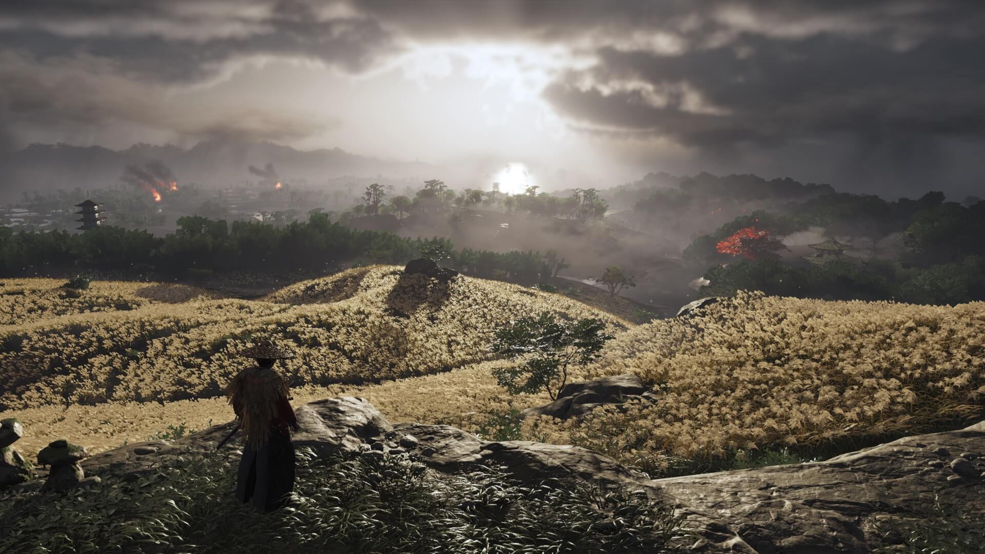
Whether in Kurosawa mode or not, Ghost of Tsushima is almost always framed in a beautiful way in just about every moment in the game. The countless fights are set with stunning vistas as your backdrop or just the natural beauty of Tsushima island itself. There's no surprise why our readers chose Ghost of Tsushima.
Third Place - Cyberpunk 2077
Developer: CD Projekt Red | Release Date: December 10th, 2020

By Austin Suther
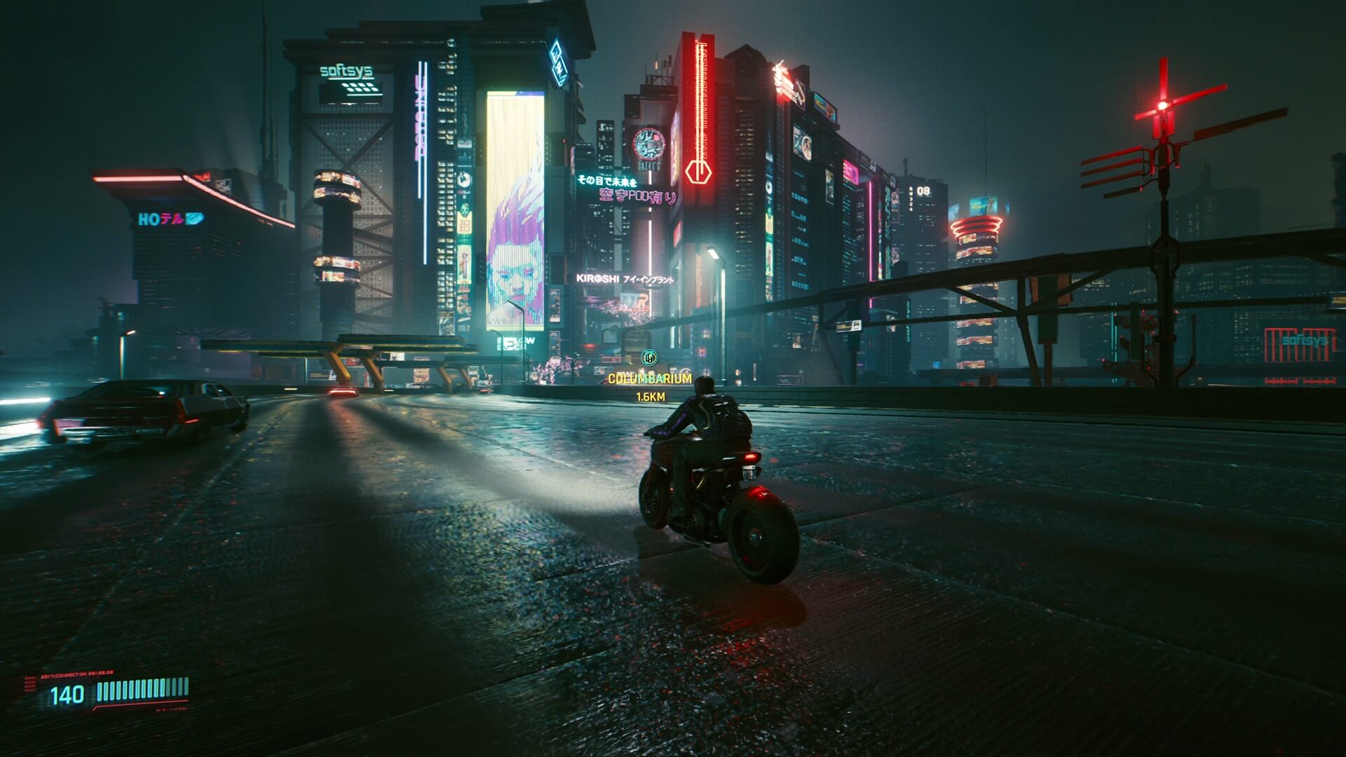
While Cyberpunk 2077 didn’t live up to some of its expectations, the world itself is a marvel to behold. Night City is the most advanced, detailed, rich city I’ve ever explored in a video game. It’s hard to say if any current game matches the scale of this city. Night City is so effective and breathtaking due directly to Cyberpunk 2077’s visual design.
Each section of Night City is unique from one another, filled with incredible textures, lighting, and atmosphere. Take a second to look at the skin and clothing on a character, as well as the way the face moves. It’s simply insane to think that we’ve come this far, and a game looks this good. Let’s not forget the ostentatious advertisements plastered throughout Night City; as detestable as some of these may be, their design is clever and meticulously made. All of these features are worthy of praise, but there is one unfortunate caveat: can your computer and console run Cyberpunk 2077?
Second Place - Ghost of Tsushima
Developer: Sucker Punch Productions | Release Date: July 17th, 2020

By Samuel Guglielmo
Every piece of samurai media needs to have that one part where the two people run at each other, slash at each other with swords, then stand there for a few moments while cherry blossoms fall before eventually, someone dies. It's the law. Ghost of Tsushima has this, and that's all it really needed. It just turns out that it also has a lot more too.
It's actually shocking how straight-up beautiful the game can manage to be at times. One fight I loved happened in an ankle-high water area, leaving many attacks to splash water dramatically. Outside of combat just wandering the world is a treat thanks to the flowing fields of flowers and long grass. I have to give a special shoutout to the Kurosawa mode, which makes the game black and white and really ramps up the wind.
If you got a super nice 4K TV, then you can't go wrong with Ghost of Tsushima. It's lovely, and I had a lot of fun making use of its photo mode for that perfect shot.
Winner - Hades
Developer: Supergiant Games | Release Date: September 17th, 2020

By Robert Scarpinito
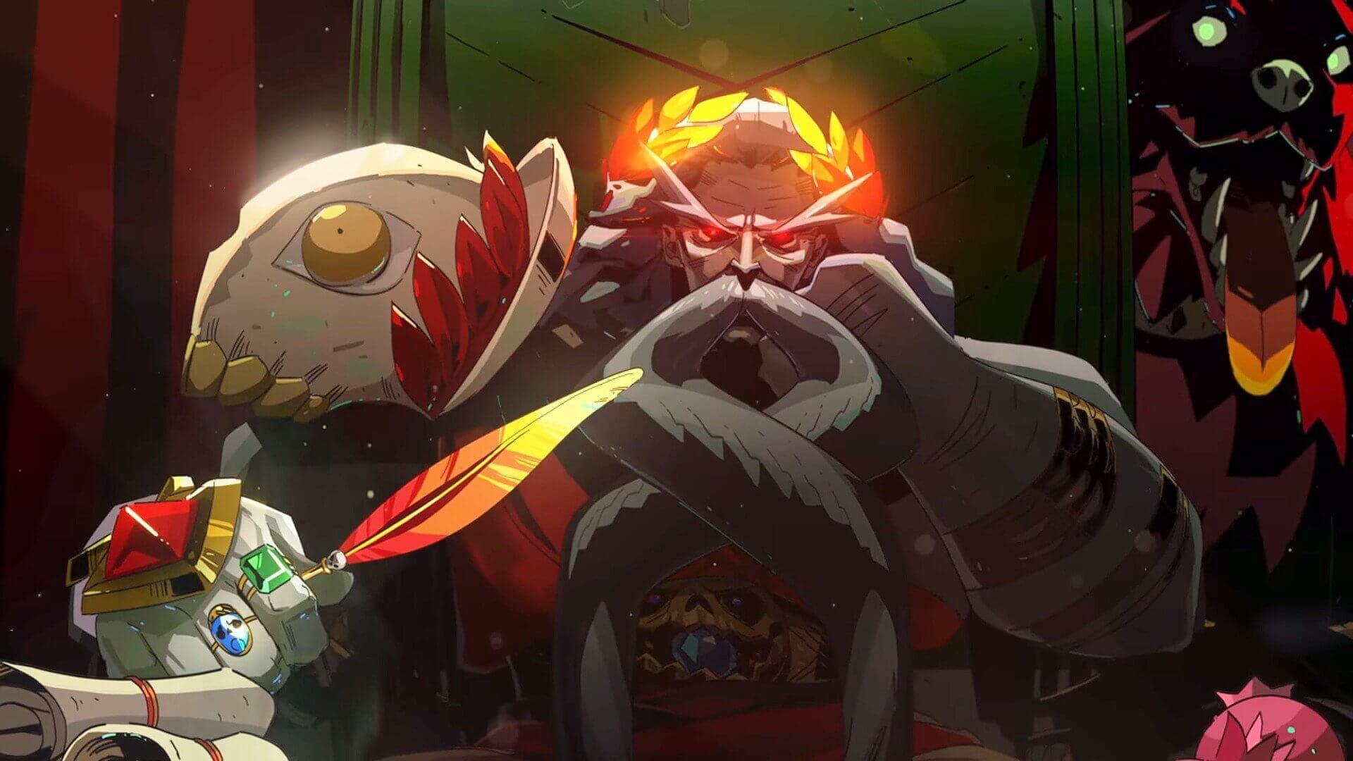
From start to finish, Hades is a beautiful game to look at. The designs of each stage have so much vibrant character and clearly convey the world you’re in. Tartarus feels bleak and hopeless, drab and dreary. On the other hand, airy, green wisps and dreamy clouds define Elysium, the afterlife home of heroes. The artistic direction brings each of these locales to life as you claw through them, beating back monsters and demons.
We can’t talk about Hades’ visual design without mentioning the gods, either. The artwork for each god and goddess radiates so much character. Just one look at Artemis or Poseidon tells you so much about their personality. A lot of them are also hot as hell, as you’d expect from Greek mythology.
Look at Dionysus as an example. His character design is dotted with grapes, a common symbol attributed to him (and relevant to the wine he dearly loves), and his leopard-skin cloak calls back to how he’s commonly depicted atop a leopard in mythology. The poison ivy, another symbol often attached to him, adorns his headdress and wrapping. Best of all, purple plays a major role in his design, representing the intersection grapes, wine, and poison. This translates to the visual cues in the gameplay too, as Dionysus’ signature affliction, Hangover (which is basically poison), is symbolized by his unique purple hue.
Each god in Hades has this level of depth and recognition. At a certain point, you’ll recognize a god, their boons, and effects by color alone. The visual language Supergiant created here isn’t just visually attractive; it effectively, concisely conveys mechanically important information, so every run feels that much smoother.
Have a tip, or want to point out something we missed? Leave a Comment or e-mail us at tips@techraptor.net
